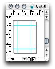
I’ve been using Freehand for 13 years (eek!), if my memory serves me right, Freehand document icons have always had little “gridlines” on them:
![]()
They look just like the gridlines in actual Freehand documents:

Just got my copy of Studio MX through and installed Freehand MX, the gridlines on the document icons have gone:
![]()
I think its a shame. The icons have lost a subtle visual clue that linked the document with the workspace.